Process Apps

art

No no no not paypal.

I’m talking artistic process apps.

These include Fresco from Adobe.

This app has been good to me. For more on it, see my instagram account. I use Fresco there MOST of the time. For more examples, the posts I’ll be putting up every Thursday are built there. But! You like visuals. What is with Fresco, Keegan?

Fiiiine.

A recent creation – Umlaut, for a DnD campaign.

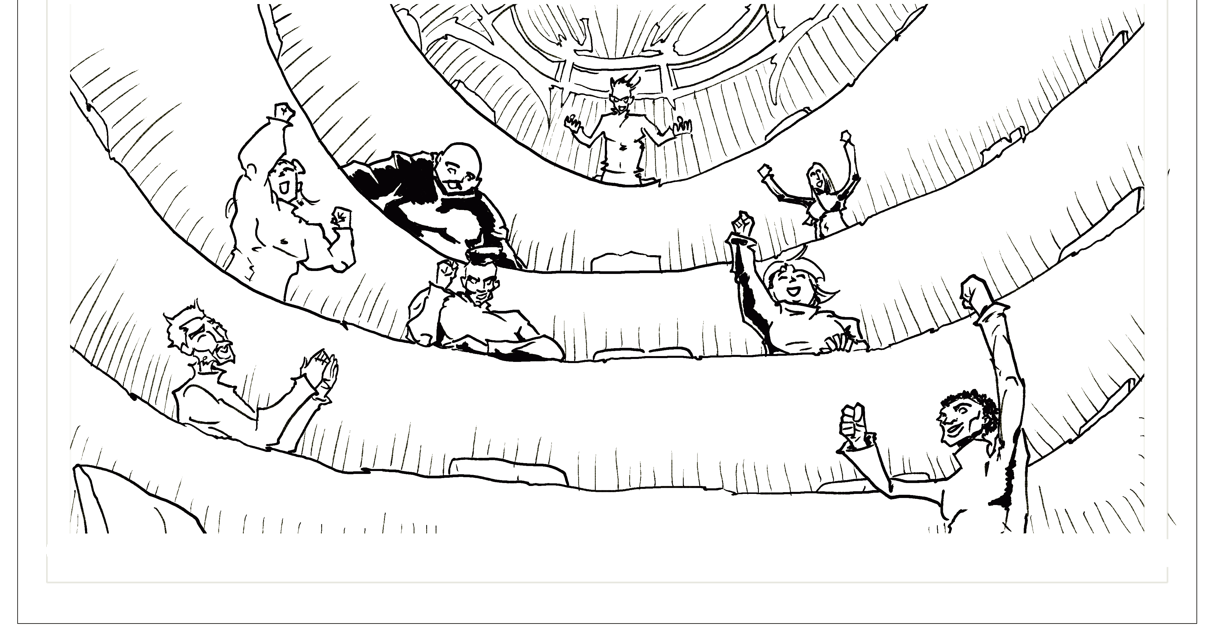
So Fresco is where I started Lightreaper and where I drew the first few panels.

What I love about it –

  • Layers
  • Intuitive Drawing
  • Touchpad like subtraction and zooming

What I hate about it –

  • there are limited features for shapemaking, like for example, tracing a circle versus filling one in (which you can do) which make exact art MUCH harder (maybe I’m missing something)
  • my touchscreen with it is finger-based versus pen based/stylus based so I can’t see it as precisely

That said, I’ve made a ton of art on it.

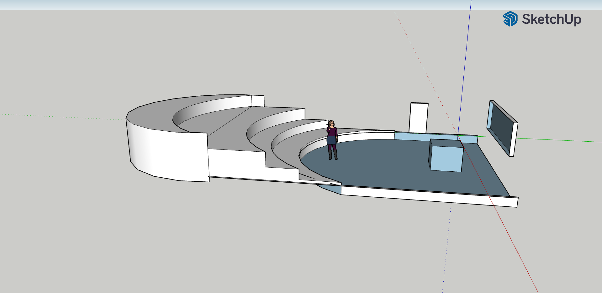
My next App I’ve used is Figma. I love Figma. Sometimes I don’t know why. But I do love it for gutters, narrative and speech bubbles, and layout planning, and for yeeting my text responsibilities over to James, my writer.

I need to get MUCH more used to Figma before I begin breaking it down, but I will say, it can get cramped by large file sizes/ text.

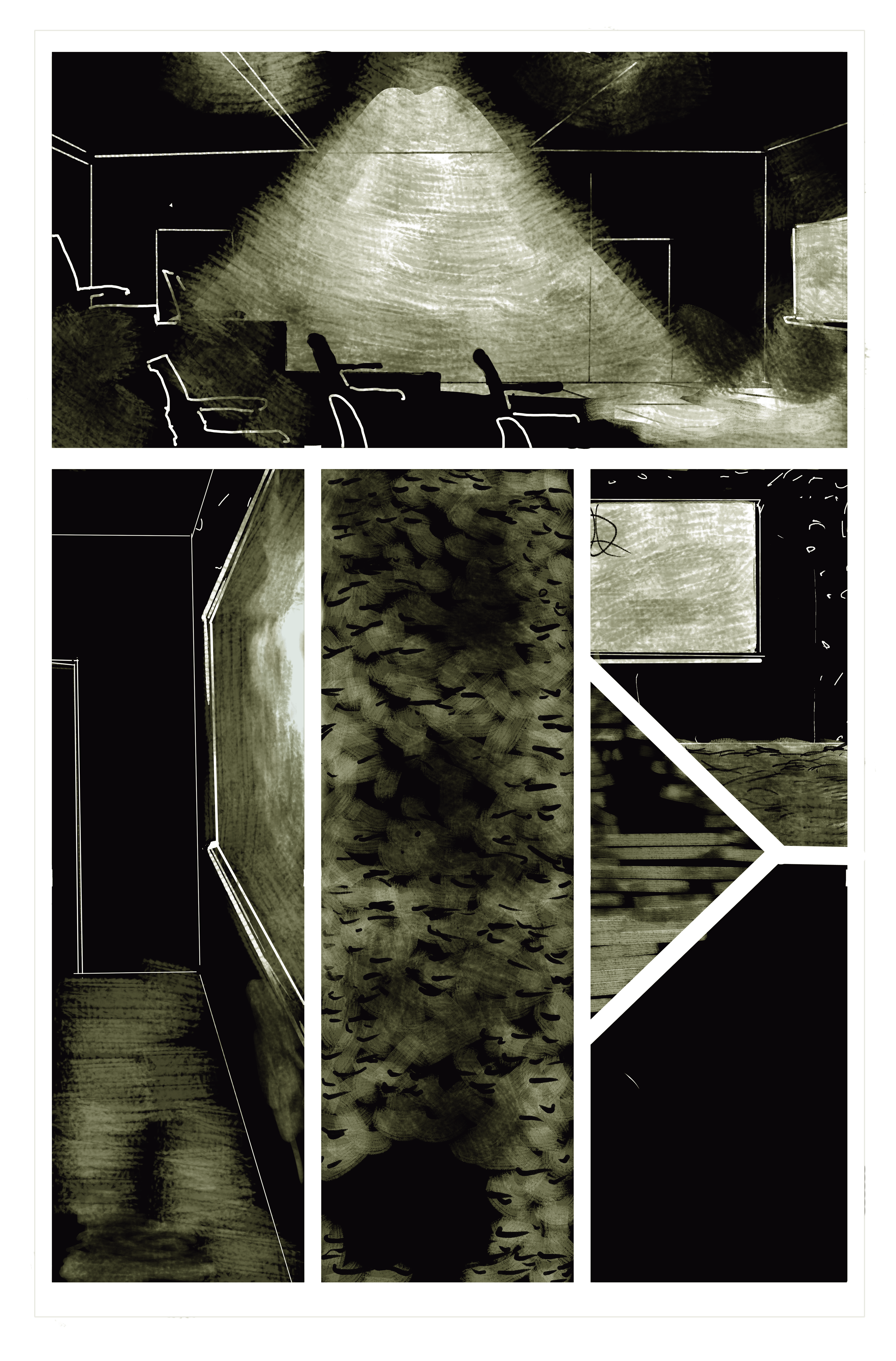
My third app I’m loving is Krita. It’s pretty great if you keep in mind the pixel counts mentioned by such greats as Jamie McKelvie. There are also a ton of useful posts on using it. I’ve found it cheaper than Adobe and as useful on my Cintiq.

So yeah! Those are my apps of choice. There is a HUGE difference between Fresco and Krita, which I will need to correct for as I move forward. I will say, Krita is not great on mobile, and Fresco is therefore more mobile, as it were, even if Krita is far more accurate and adjustable.

Perspective

art, Plans

So one of my biggest stumbling blocks as I get into comic book crafting is perspective. In other words, tonight for me is a back-to-school night… during the last week of the semester.

Like, I’m fine with figures. I’ve been drawing figures since I was in Kindergarten. But like. Backgrounds. Making them match up with figures and look good, simple, and defined… it’s tough. It’s time consuming. And it’s something I’m sure I’m doing ABSOLUTELY wrong.

This became a major issue for me in a combat scene in a classroom. It’s got some of that great classic comic book action, but it takes place in a very defined space. I think I approached this scene all wrong. Here’s what we’re working with:

A bunch of turtlenecked doodah’s cheering in a circular auditorium.

So let’s look at this. It’s a very steep auditorium. It’s in the round. They’ve got chairs. But then I need to build a combat scene for them, a podium, and a floor chair.

So I make this.

OTT?

Maybe. I want to be able to zoom in, zoom out, and reference a curve that makes a consistent space for a bunch of characters fighting in a large classroom (clearly here deeper than it is wide – it would likely be wider than this in a real class auditorium setting).

Right now my backgrounds look like this.

A little dark – literally, in the world, but also in the mood a bit, I think.

So as you can see, I’m dealing in more abstract terms right now. There’s *some* perspective, and granted, I’m messing like hell with where the viewer is (that bottom middle panel is a bird’s eye view… and my own take on darkened carpet).

So tonight as I revise my last three pages of the first issue, I’m bringing it back to the basics of backgrounds and journeymanning my way through Krita perspective tutorials.

Tonight’s mantra: “there has to be a better way.”

I’m trying this guide now (well into my first issue illustrations)

I’m also going back through these ones:

This is a awesome series with great workarounds and tips 🙂

Anyway, readers, hope you all enjoy! Don’t forget to follow our Newsletter and support our Patreon so you can see some great finished screen backgrounds I’ve been working on!

-Keegan