A Short rant

art

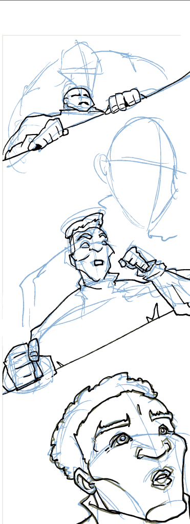
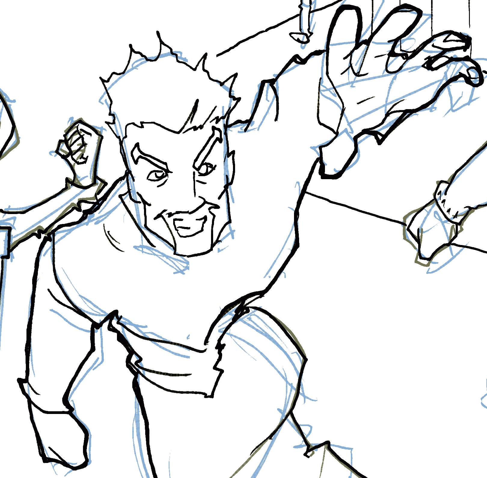
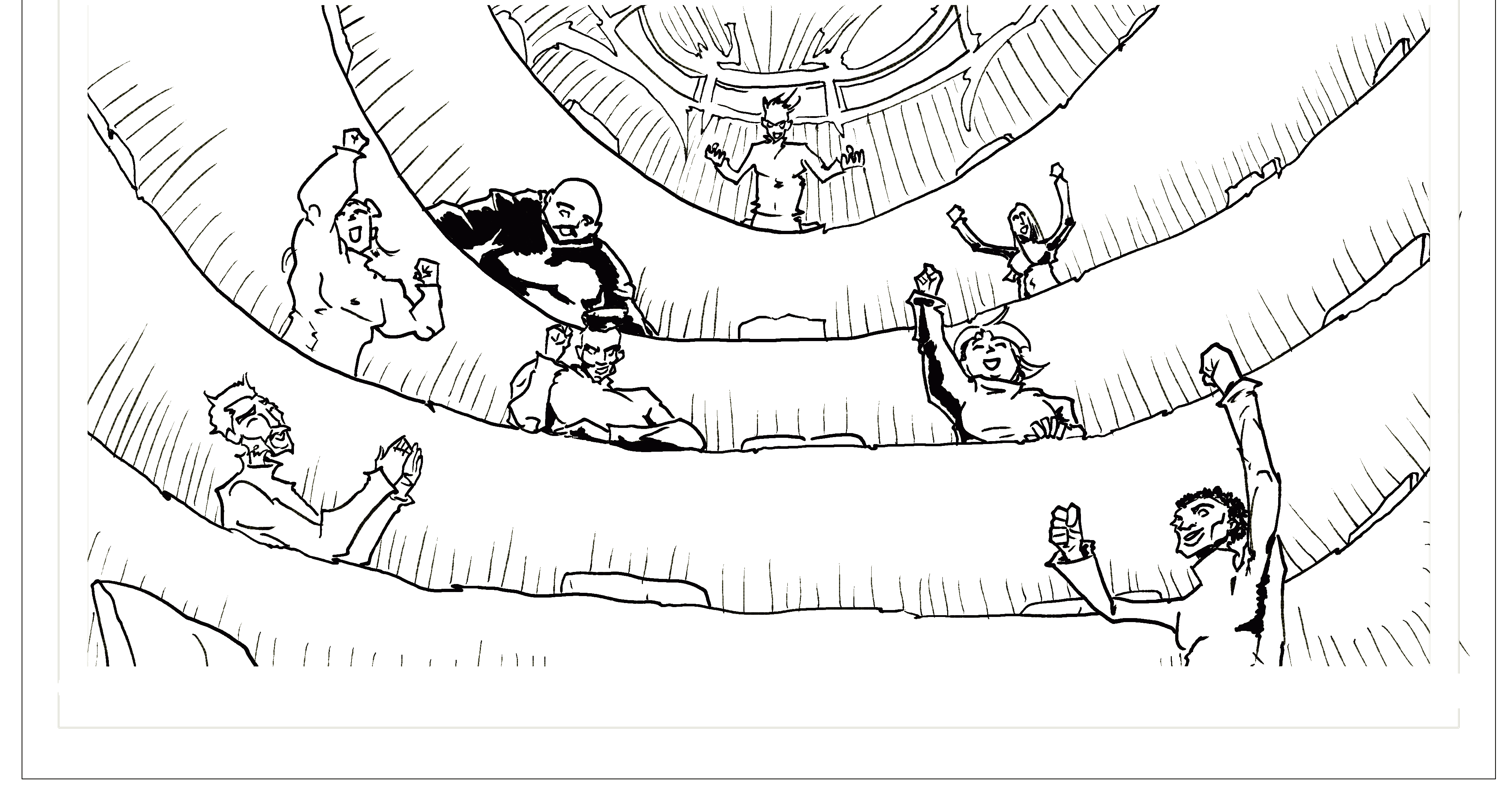
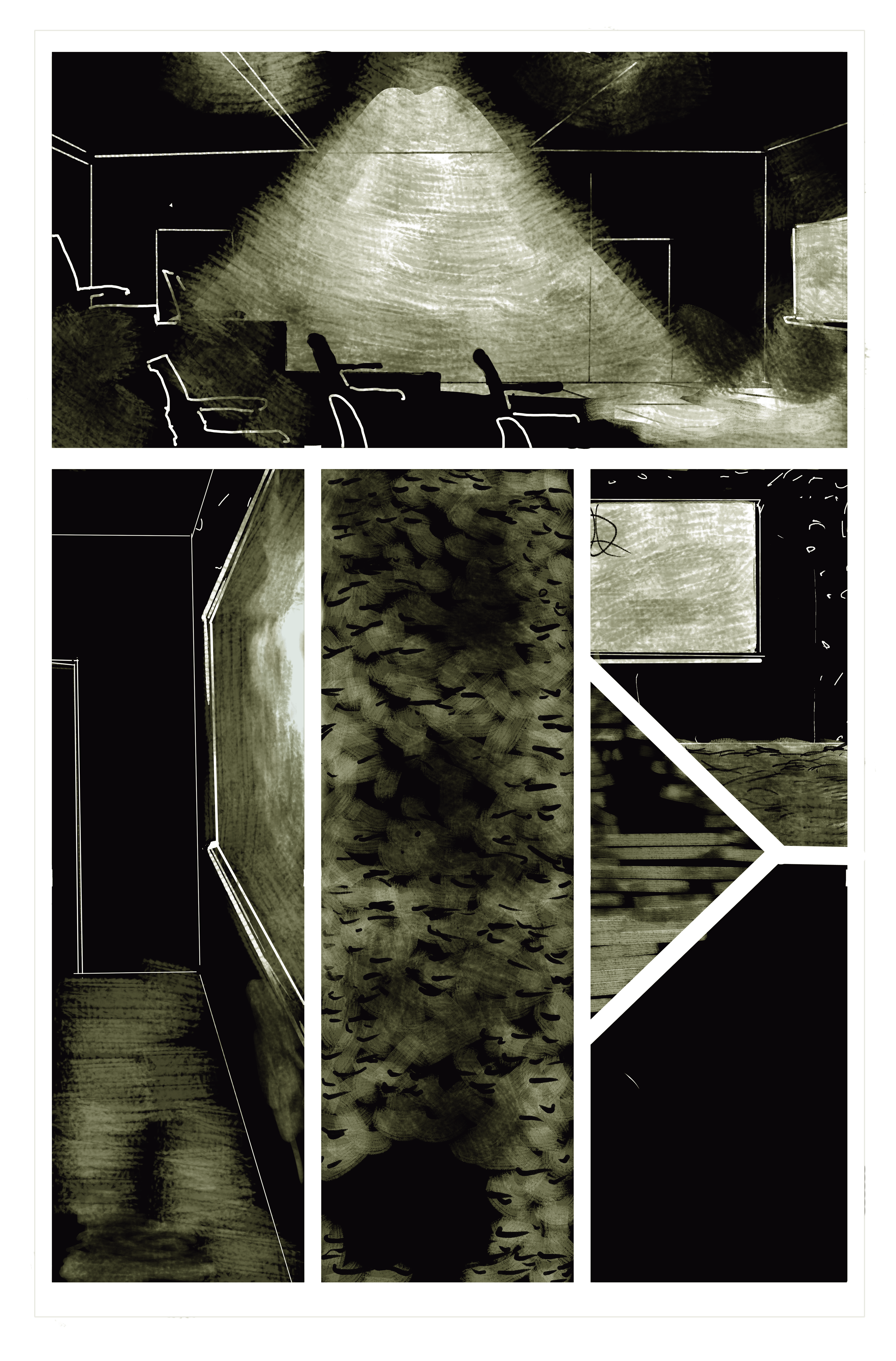
Hey folks – shorter day today. I meant to do a longer post here about my process (TL:DR – Fresno to Figma to Krita to Krita AND Figma… so far!) but instead I’m shy on time and out of spoons.

And AWAY. WE. GO!

A) What is with Facebook and its blog posting policy? Back in my day, I used to be able to publish these things right to my main personal page, and what’s more, I could do it while I was going uphill, both ways, in the snow, sleet, and rain! Now there’s 25 extra steps.

B) WordPress’s new block posting style is hella hard to go back and edit through. Lovely potential visuals, but it feels very clunky now. Granted, I’m just getting back into it.

C) Okay, there’s silver linings to every playbook. Having to post to pages means I generate content for Light Reaper’s social media (yay) even if it is twenty more steps to get eyes on the content (boo).

D) In further silver linings, this rant got me one more post for my own personal goal of a year straight of daily blog posts.

More visuals to come tomorrow – remember, the schedule goes…

Friday – Wednesday – Light Reaper Art Process

Thursday – off/ check my Instagram and personal page for DND art tips.

My focus on the blog tomorrow will be on using Fresno for making phone art.

Characters? Games!

art

…For all you homestar runner fans out there.

But no, while working on perspective, another issue I’ve come across is character faces. Specifically, background/crowd character faces. Specifically, making sure that each of the characters I’m setting up gets used and placed in a proper place. This has two areas of increasing complexity – bodies and faces.

These guys again?

I must love this panel! Or maybe I find it properly problematic. Anyway, you’ll note that each character here has a face. Should have just done smiley faces, or made them more shadowy.

Naaaaah.

Instead, each character here has their own body type and facial feature choices. So! I’ve got to place those jerks in matching panels as I work my way through. For example, on the next page…

Bruiser

This guy’s gotta be a lot smaller and seen from a ways below.

But I’m also futzing with the panel shot to make sure he’s in it. He’s the biggest threat these guys have got!

Mid Field

Is the guy below him. He’s got to be

a lot smaller than I originally sketched.

Handsome

He’s the prettiest person

I drew in that last panel. He

gets the Ezmerelda closeup

(thank you,

Hunchback).

Body Type

I am faithful to this with my characters, but I’m noticing my crowds get a little wonky. Case in point…

Professor here gets a workout on the next page…

Actually, when I really look at him, I realize two things (three if you count that his body is actually pretty consistent)

  1. His initial neck. Is way too thin.
  2. I gave that man MUTTON CHOPS! How dare I take them away…

But yeah, in summation, this is the tough part about character detail. I have to use my secondary screen to reference back to work I’ve made on previous pages.

As a note on viewability and process, my current workaround is to make PNG or JPEG versions of older pages I’ve “finished” so I can review them for details.

I think I’ll write more on this tomorrow with something about all the digital tools I am and/or have been using…

‘Til then, excelsior!

-Keegan

(dont’ forget to like our Facebook, follow our Newsletter and support us on Patreon!)

Perspective

art, Plans

So one of my biggest stumbling blocks as I get into comic book crafting is perspective. In other words, tonight for me is a back-to-school night… during the last week of the semester.

Like, I’m fine with figures. I’ve been drawing figures since I was in Kindergarten. But like. Backgrounds. Making them match up with figures and look good, simple, and defined… it’s tough. It’s time consuming. And it’s something I’m sure I’m doing ABSOLUTELY wrong.

This became a major issue for me in a combat scene in a classroom. It’s got some of that great classic comic book action, but it takes place in a very defined space. I think I approached this scene all wrong. Here’s what we’re working with:

A bunch of turtlenecked doodah’s cheering in a circular auditorium.

So let’s look at this. It’s a very steep auditorium. It’s in the round. They’ve got chairs. But then I need to build a combat scene for them, a podium, and a floor chair.

So I make this.

OTT?

Maybe. I want to be able to zoom in, zoom out, and reference a curve that makes a consistent space for a bunch of characters fighting in a large classroom (clearly here deeper than it is wide – it would likely be wider than this in a real class auditorium setting).

Right now my backgrounds look like this.

A little dark – literally, in the world, but also in the mood a bit, I think.

So as you can see, I’m dealing in more abstract terms right now. There’s *some* perspective, and granted, I’m messing like hell with where the viewer is (that bottom middle panel is a bird’s eye view… and my own take on darkened carpet).

So tonight as I revise my last three pages of the first issue, I’m bringing it back to the basics of backgrounds and journeymanning my way through Krita perspective tutorials.

Tonight’s mantra: “there has to be a better way.”

I’m trying this guide now (well into my first issue illustrations)

I’m also going back through these ones:

This is a awesome series with great workarounds and tips 🙂

Anyway, readers, hope you all enjoy! Don’t forget to follow our Newsletter and support our Patreon so you can see some great finished screen backgrounds I’ve been working on!

-Keegan

Atheist’s Paradise

Uncategorized

Hey all! So I’m working on this show,

and I’ve got a view things to share with you, namely video content

(huzzah! video content! put ‘er there, keegan!)

yeah, guys, I would, but… not a video content site yet. I’m so cheap! so, for now, we have links:

Interview with Megan Behm, director:

Interview with Bill Goodman, Playwright:

Talkback footage from our second draft:

if you like what you see, follow these guys on @universeplayers and at edge of the universe players 2 on facebook!