
So one of my biggest stumbling blocks as I get into comic book crafting is perspective. In other words, tonight for me is a back-to-school night… during the last week of the semester.
Like, I’m fine with figures. I’ve been drawing figures since I was in Kindergarten. But like. Backgrounds. Making them match up with figures and look good, simple, and defined… it’s tough. It’s time consuming. And it’s something I’m sure I’m doing ABSOLUTELY wrong.
This became a major issue for me in a combat scene in a classroom. It’s got some of that great classic comic book action, but it takes place in a very defined space. I think I approached this scene all wrong. Here’s what we’re working with:
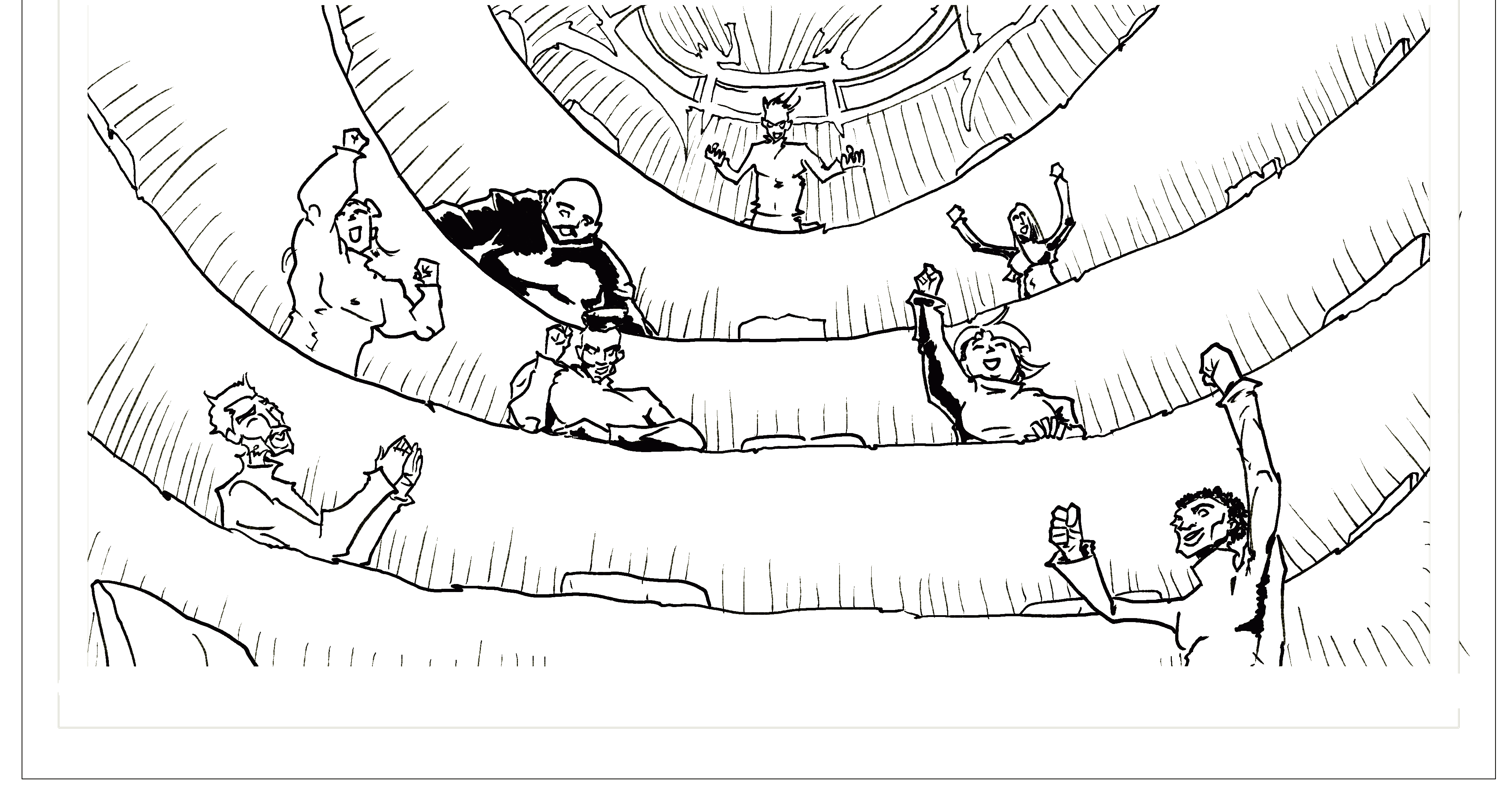
So let’s look at this. It’s a very steep auditorium. It’s in the round. They’ve got chairs. But then I need to build a combat scene for them, a podium, and a floor chair.
So I make this.
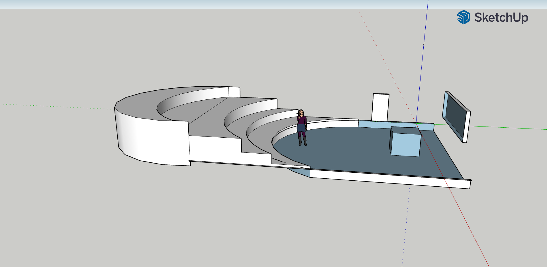
OTT?
Maybe. I want to be able to zoom in, zoom out, and reference a curve that makes a consistent space for a bunch of characters fighting in a large classroom (clearly here deeper than it is wide – it would likely be wider than this in a real class auditorium setting).
Right now my backgrounds look like this.
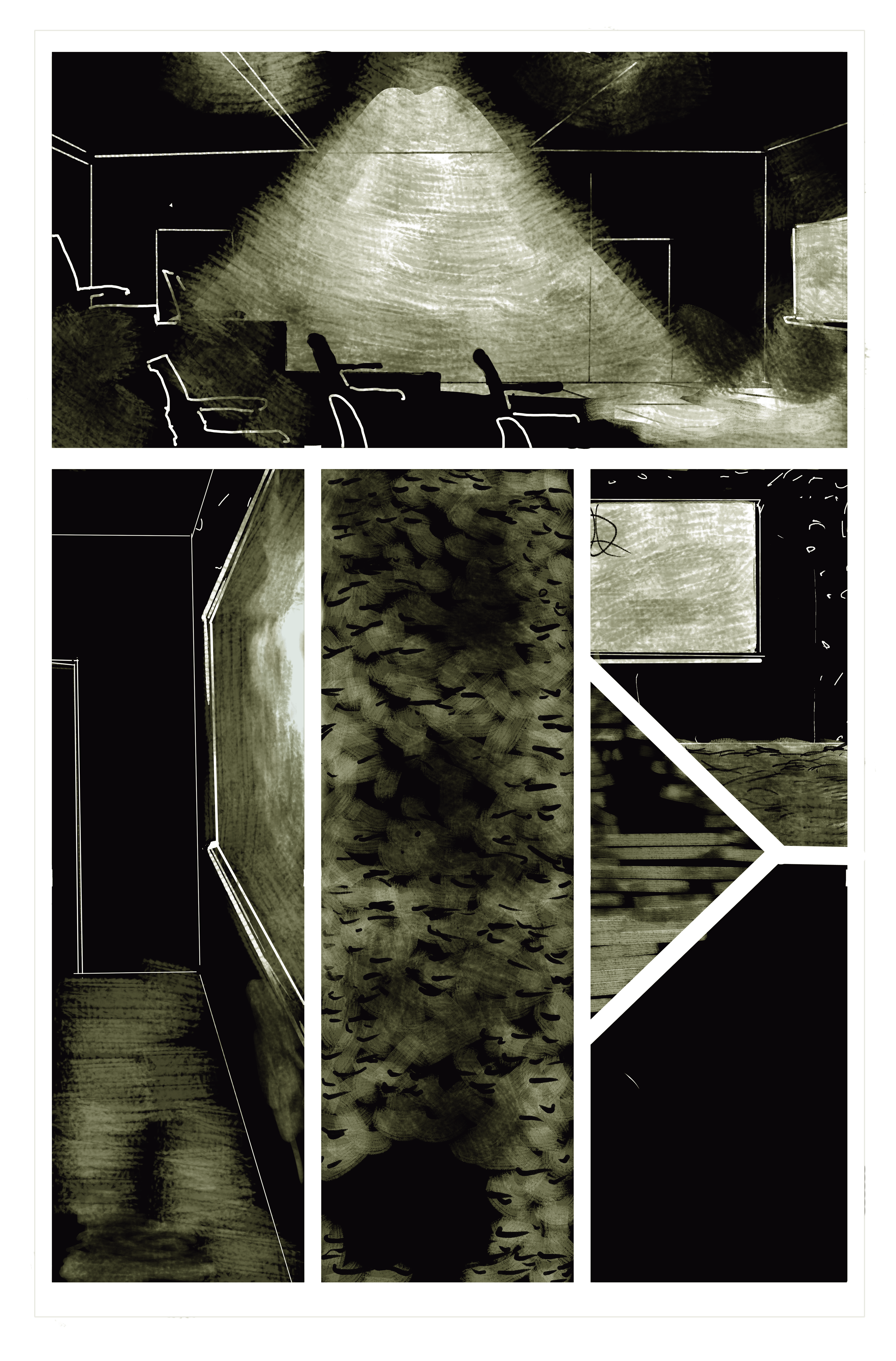
So as you can see, I’m dealing in more abstract terms right now. There’s *some* perspective, and granted, I’m messing like hell with where the viewer is (that bottom middle panel is a bird’s eye view… and my own take on darkened carpet).
So tonight as I revise my last three pages of the first issue, I’m bringing it back to the basics of backgrounds and journeymanning my way through Krita perspective tutorials.
Tonight’s mantra: “there has to be a better way.”
I’m trying this guide now (well into my first issue illustrations)
I’m also going back through these ones:
This is a awesome series with great workarounds and tips 🙂
Anyway, readers, hope you all enjoy! Don’t forget to follow our Newsletter and support our Patreon so you can see some great finished screen backgrounds I’ve been working on!
-Keegan


